
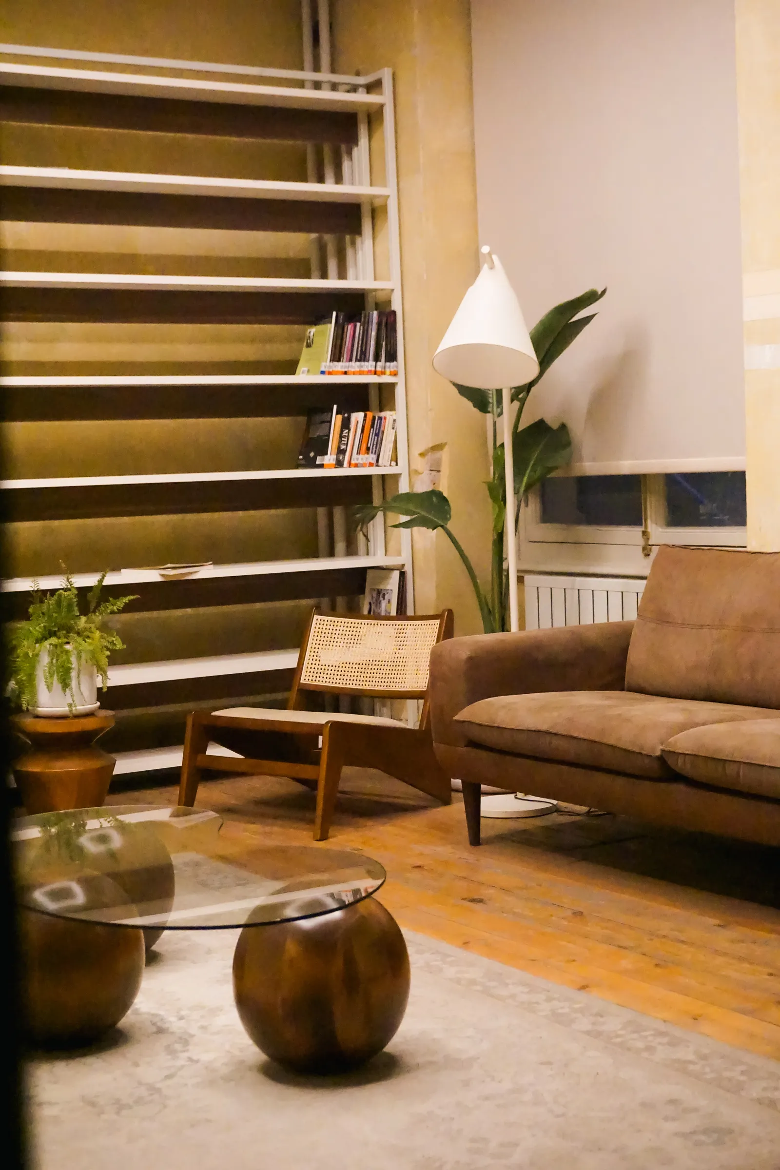
Warm or neutral is often treated as a quick shopping choice, yet the decision becomes clearer when made inside the room’s material palette. Paint, timber, stone, fabric and adjacent spaces all influence what the family sees. The useful aim is not to discover one colour that is best for every Saudi home. It is to choose a coherent appearance for your rooms and record that choice accurately enough for the supplier and installer to reproduce it.
Separate colour preference from brightness
When a sample feels uncomfortable, describe whether you dislike its colour, its brightness or the direct view of the source. These are different observations and may lead to different design responses. Compare shortlisted samples under similar conditions before deciding that one colour category is unsuitable. Ask the designer to keep the comparison focused on the aspect you are judging. Otherwise, a much brighter sample can dominate the demonstration and make a colour decision seem more certain than it actually is.
Use the actual material palette
Bring together the paint sample, cabinet finish, flooring and an important fabric. View them as a group under the proposed light rather than approving each one in a different showroom. Include both a pale and a darker surface if those are part of the design. Discuss which relationships matter most: the cabinet against the wall, the sofa beside the floor or the stone next to a metal trim. This turns an abstract preference into a comparison of the home you intend to build.
Review adjoining rooms as one view
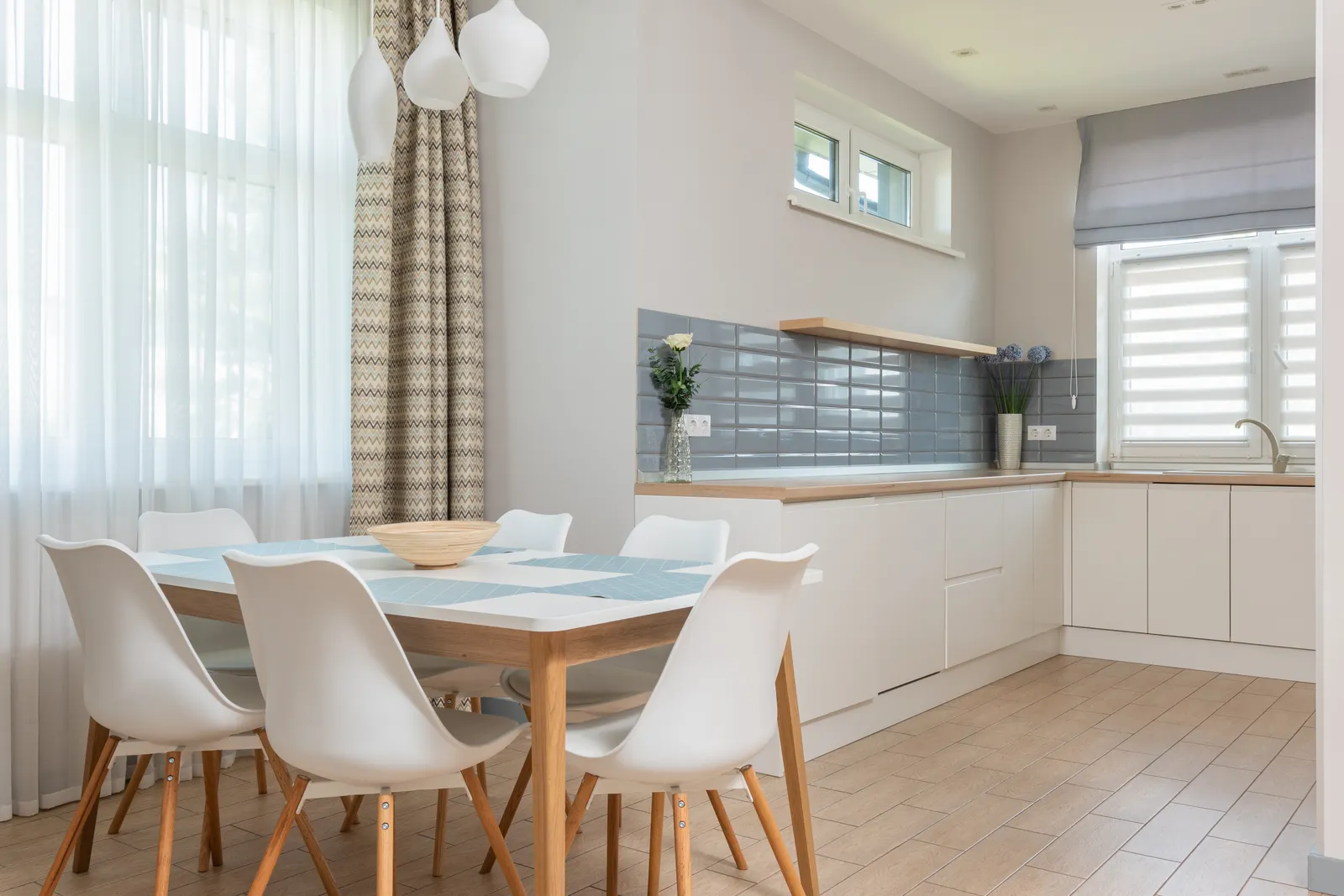
Stand where two connected spaces are visible together. A deliberately different appearance may help distinguish their uses, but an accidental contrast can distract from carefully coordinated materials. Ask which lighting groups will normally operate at the same time and compare that situation. In an open living and dining area, the transition deserves particular attention. Do not force every room to be identical; instead, make the relationship intentional and keep a record of the selections that must be considered together during procurement.
Test the evening routine you will use
A showroom demonstration is a starting point. Ask how the selected appearance can be checked in conditions closer to the intended evening routine, including the actual controls where possible. Consider reading, conversation and watching television separately. If adjustable colour is proposed, decide which settings the household would genuinely use and how they would select them. More settings are helpful only when they make daily life easier. Record a preferred normal setting so handover does not leave the family experimenting without a shared reference.
Record a product reference, not just a word
Terms such as warm and neutral are useful in conversation but are not a complete purchasing specification. Philips identifies colour temperature through Kelvin values on product information. Retain the exact shortlisted reference and selected variant, along with a note about the approved sample. Ask the supplier to confirm the order against that record. If a replacement is proposed, review its information and appearance before accepting it, especially where repeated fittings or adjacent rooms are expected to match.
Keep preference open until the sample review
Avoid making the entire material scheme depend on a colour description that nobody has seen with the selected finishes. Set a sample-review point before committing to the full order. In a hypothetical project, a family may discover that its preferred fabric looks different under two shortlisted products and choose the one that preserves the intended relationship with the cabinetry. That is a project preference, not evidence that the other product is wrong for every room or household.
Your practical checklist
- Compare light with paint, flooring, cabinetry and fabric together.
- Check connected rooms and ordinary evening scenes.
- Approve the actual reference and variant before the full order.
Frequently asked questions
Is warm lighting suitable for every living room?
It may suit your preference, but test it with the room’s finishes and activities. The decision should reflect the actual household and products rather than a rule based only on the room name.
Should I rely on photographs?
Use them to communicate an intention, then confirm with samples. Camera settings and screens can change the appearance, so a photograph is not a reliable substitute for the approved product record.
Is adjustable colour worth considering?
Consider it when you have distinct routines and want that flexibility. Ask for a simple demonstration and confirm compatibility through the project team before making it part of the purchase.
Sources and further reading
Sources support the specific facts identified below. Planning examples and checklists are editorial guidance; photographs are illustrative.
- Philips — Colour temperature — Supports the limited statement that Kelvin is identified in lamp product information.