
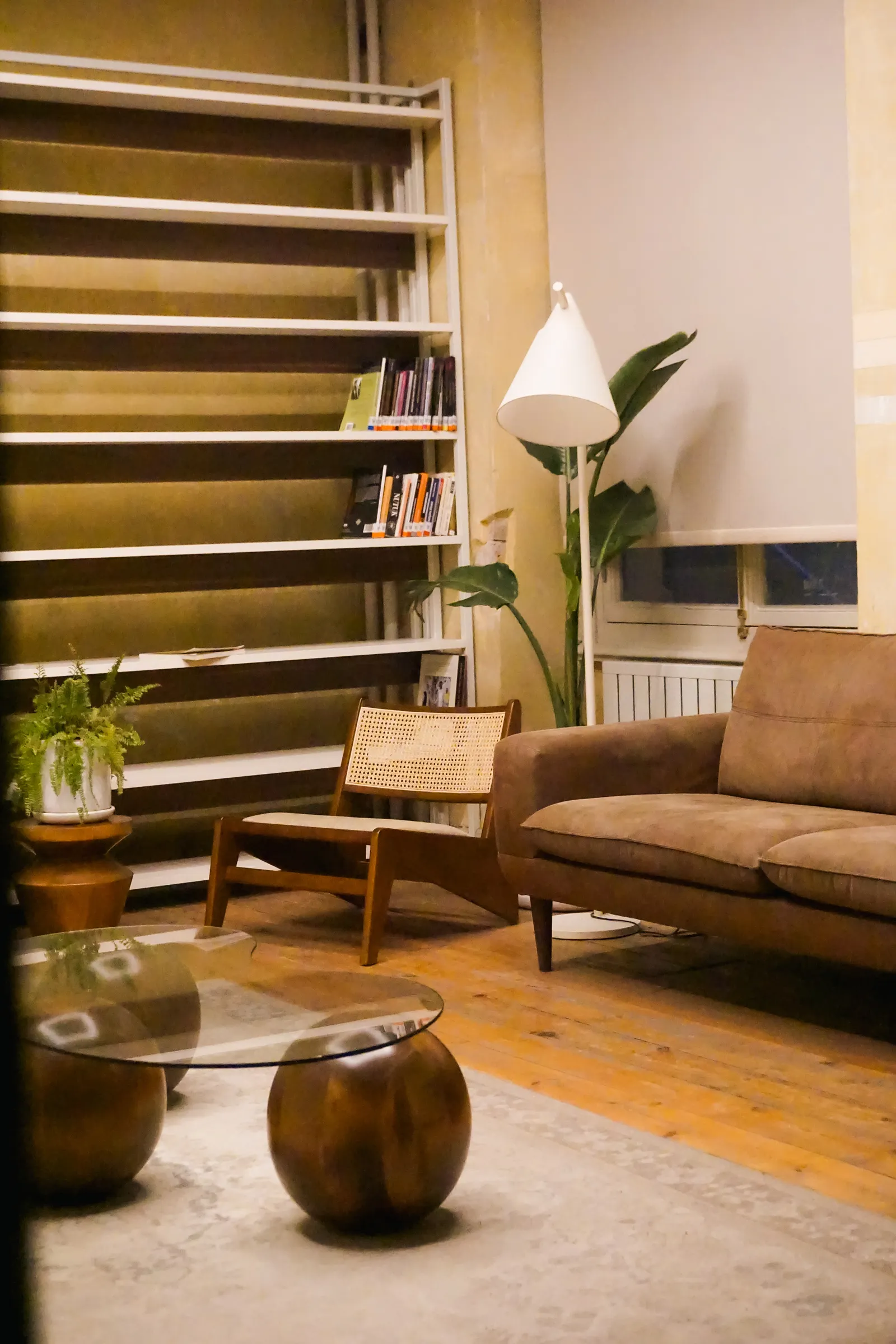
An accent wall directs attention to a chosen surface, while one colour throughout can keep the room’s boundaries visually quieter. The decision should follow the architecture, furniture and activity rather than a rule that every room needs a feature. Ask what you want people to notice first and whether the proposed wall supports that purpose. A consistent colour can be deliberate, and a contrasting wall can be restrained when its location and extent are well considered.
Find the room’s real point of attention
Look at the bed, seating group, dining table, artwork or architectural feature that organises the room. Ask whether a coloured wall would support that element or compete with it. A wall with several unrelated openings may be a weak candidate even if it is the largest surface. Draw the proposed colour area behind the actual furniture, including its height and position. The goal is a clear relationship between the surface and the room’s purpose, not merely a patch that is different from its neighbours.
Use one colour when continuity matters
Consider a unified colour when the room already contains strong furniture, patterned textiles or several architectural interruptions. It can provide a consistent background without requiring the owner to invent another focal point. Decide how ceilings, trims and adjoining surfaces will relate rather than assuming everything must use one identical product. A quiet wall scheme still needs considered finish and lighting. Assess it with the furniture present so it is not rejected simply because an empty rendering seems less dramatic than a feature-wall image.
Define where the accent stops
Mark corners, openings, returns and edges on a drawing. Decide whether the colour stops at a wall boundary or continues around a feature, and show that decision to the painter. An unclear stopping point can make a deliberate accent look accidental. Review the result from the doorway and seated positions, not just from directly in front. If the colour crosses behind a curtain or cabinet, consider how much remains visible and whether the intended emphasis survives when the room is furnished.
Choose contrast and finish deliberately
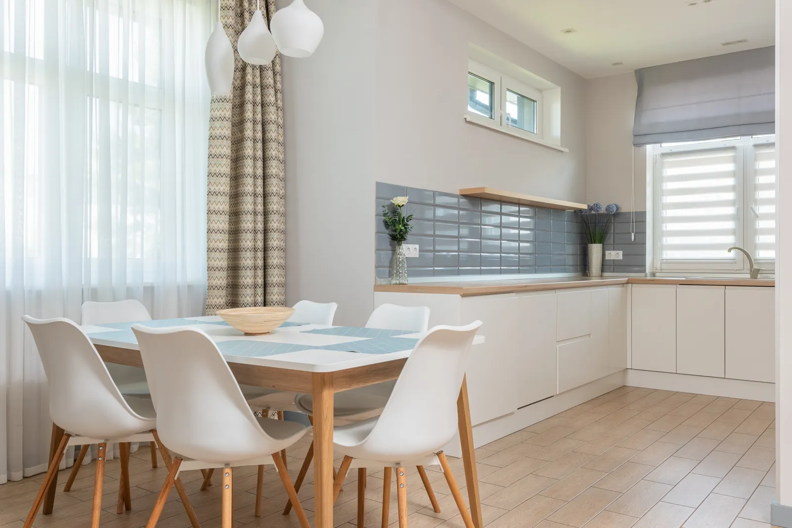
An accent does not have to be the darkest or brightest colour available. Compare a close tonal difference with a stronger contrast and decide which serves the room. Include finish in the sample: Benjamin Moore’s sheen guidance notes that reflected-light differences influence appearance. A change in finish can add another layer of emphasis, so do not treat it as an invisible technical detail. Approve the actual colour and finish together, then view the sample alongside upholstery, artwork and the main lighting.
Check the room in the larger home
Stand where the room is seen from the corridor or another shared space. A strong wall may become part of several rooms’ views, not only the room in which it is painted. Decide whether that connection is welcome. You can repeat a related colour in a small object elsewhere or keep neighbouring backgrounds quieter. Avoid adding accents to every visible wall merely to balance the first one. The overall sequence should remain understandable as people move through the home.
Test both choices before committing
Compare a unified version and an accent version using the same furniture arrangement. In a hypothetical bedroom, a calm continuous background may let a patterned headboard lead, while a plain headboard could work with a defined colour behind it. These are visual options, not rules attached to a style label. Use samples and a marked drawing to decide. Record the chosen boundaries so future repairs or furniture changes can be evaluated against the original purpose of the colour scheme.
Your practical checklist
- Identify the room’s intended point of attention.
- Compare unified and accent versions with identical furniture.
- Mark every colour boundary and return.
- Approve contrast and finish with physical samples.
- Review views from neighbouring rooms and doorways.
Frequently asked questions
Must the accent wall be behind the sofa?
No. Choose the surface that supports the room’s organisation and intended focus; the sofa position is one possible relationship, not a rule.
Does one colour make a room unfinished?
No. A unified background can be a complete choice when furniture, materials and lighting provide the desired interest.
Can a subtle colour difference work as an accent?
Yes. Test whether the difference is visible enough for your purpose and whether the selected finish strengthens or softens that effect.
Sources and further reading
Sources support the specific facts identified below. Planning examples and checklists are editorial guidance; photographs are illustrative.
- Benjamin Moore — Choosing a paint finish — Short reflected-light appearance reference; accent-wall decisions are original editorial guidance.